What I learnt in my first month as a Self-Taught Graphic Design Intern

Though the journey of a self-taught graphic designer is very unconventional, you will be surprised by just how many of them are out there. Encouraged by this and the spare time I had on my hands due to the pandemic, I started learning things that I was interested in. That is how my graphic design journey began – by taking an online course. A few passion projects later, I began to actively pursue professional experience in the industry. My journey so far as a graphic design intern at Penthara Technologies has been a ride of learning and discovering. Here are a few takeaways from my first month at the job that stood out to me –

Learn, Unlearn and Relearn

This is a sound advice from Alvin Toffler which anyone who wants to get ahead in their career would benefit from. To make work that is clear in its purpose, you first need to understand the core principles of design. Right from the first day at my internship, the company’s CEO put an extra emphasis on learning design from all possible sources – people, videos, blogs, and books. It does not matter where you are in your design journey, always be a student of the craft.

You also need to be able to loop through unlearning and relearning if you want to stay current about the happenings in the industry. I would spend a lot of time drawing grids in Adobe Illustrator using rectangles and guides. Soon, I saw a better method to do it by dividing a rectangle, the size of the artboard, into a grid from the toolbar. Finding the latter much more efficient, I had to unlearn the previous way of making grids and relearn this new method.

Take Notes    

The one thing more important than learning is remembering. According to research, we forget about 50 percent of new information within one hour of learning it. One of the best ways in which I like to retain information is to take notes. I use OneNote to create a single, structured repository of notes about the concepts I learn. This way, whenever I forget a particular concept, I have a source to refer from instantly. Additionally, taking notes lays down a strong foundation for a better understanding of the concept.

Know the tools

Often the roadblock to creating an awesome design and bringing it alive on the artboard was my little knowledge about the tool. This could happen to anyone, as new tools are coming to the market every day. So, if you are planning to use a tool or learn a new one, make sure to know all the key operations in it. Good knowledge of tools not only helps you to decide which tool to use but also when. I found that using Canva for social media posts was much quicker and easier than Illustrator or Affinity Designer. This went a long way in increasing my productivity.

Have a 1000 Mentors

Coming from a non-design background, I did not have much exposure to people doing design except for those on social media. This is usually the case for most self-taught designers. Growing your network to include people who are doing the work that inspires you, interacting with them and seeking their guidance can speed up your learning curve. Learn from a professional, a friend or even a stranger doing a talk at an event. Anyone can be a mentor for you if they teach you something you did not know before.

Work on Your Style

As a designer you will be working on projects which call for the use of many different styles. The busier it gets working on these different styles, the easier it is to forget your own. Imitating other people's style might get the work done for now. But in the long run, you are going to end up having no style of your own. Hence, finding a style that you identify yourself with and working on it is very important as a beginner. I currently love working on minimalistic brand and identity design. However, in my internship I work on social media posts, website illustrations, blog post creatives and much more. Each of these assignments requires me to capture the essence of the company’s identity, which is very different from my personal style. That is why I regularly work on personal projects during the weekends, to hone my own expression of design. I take this a step further by learning from the process of leading design studios in identity design sector like:

Track your time

This is the most important takeaway for me from this internship. The practice of tracking the tasks which I do in my workday and how much time I spend on each one of them has allowed me to be more mindful about what I am spending my time on. It allows me to prioritize tasks accordingly and set realistic deadlines for delivering the best work possible. Also, seeing what I have accomplished for the day before I sign out makes me feel more motivated about returning to work tomorrow. For my internship, I am using the internal timesheet system provided by the company.

If you are a freelancer, I would suggest using one of the free time-tracking apps or even a pen and paper to record the time you spend on various tasks. This simple practice can help you make better use of your time and increase your productivity.

Be open to constructive criticism

It is understandable to feel deeply about your work. You spend hours making it, doing the changes and finally the review comes in. If it is good, then you are on cloud nine. But in case it is not, which could be the case many times, it is easy to slip into a loop of self-doubt and feeling inadequate. “You are not your work.” This is a sound advice given by none other than Chris Do, an Emmy award winning designer and the founder of TheFutur. Remember, we are all work in progress. Do not get overly attached to the feedback. It will also do you good to remember that majority of the feedback given is subjective to each person reviewing it. This way when a negative review does come in, you will be able to assess it objectively and make the required changes so that the design fits its purpose.

These learnings can go a long way to not just improve the quality of your work but also the systems that complement your personal growth. Finally, I think learning design is not as difficult as it is to bring discipline into your design. As a beginner in design, it was when I did my work in a disciplined and structured manner that I saw myself truly progress, skill wise and as a person.

Sanika

Authored and Graphics Designed By- Sanika Sanaye

(Creative Design Director)

Authored and Graphics Designed By- Sanika Sanaye

(Creative Graphic Designer Trainee)

Jasjit

Peer Reviewed By-  Jasjit Chopra

(CEO)

Peer Reviewed By-  Jasjit Chopra

(CEO)
Getting started with Redux in SPFx solution with React Framework

Brief of react and redux:

Redux is a framework that is responsible for managing the state for most of the popular front-end frameworks, such as React, Angular, etc. You can build web parts using any of the frameworks using redux. (Insert basics of redux)

In this post, I will walk you through how to use React and Redux to build a web part.

Implementation of redux in SPFx solution:

Today, we are going to cover some scenarios where we will be getting data from SharePoint lists using API calls and storing it in redux store so it can be re-used anywhere in the solution. It will enhance the performance of our SPFx solution by reducing the frequency of API calls. We will load the data once in the starting of our app and store it in redux store for further use.

In this scenario we are building a single page application using hash routing. In this application we are fetching data from SharePoint list in the header component and storing it in redux store using actions, then further using that data in child components. To implement hash routing in SPFx solution you can refer to the link given below.

Implement hash routing in SPFx solution ( https://ravichandran.blog/2020/06/10/react-router-in-spfx/)

If you are building multi webpart solution, then please refer to the document on how to pass data from one webpart to another. Using redux store for a single webpart solution might not be a good use-case here. When you build SPA like capabilities, that is where this type of scenario can be helpful.

Prerequisites:

Before starting one must have basic knowledge about:

  1. React Fundamentals
  2. Basic of Redux
  3. Basics of creating SPFx Solution

Referencing a React Component in Your SPFx Solution: (change heading name)

React is component-based library, we can take advantage of this feature in building our SPFx solution by building different re-usable components at specific level.

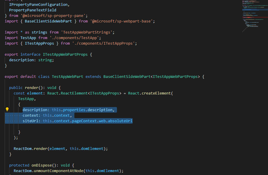
When you create a new SPFx solution all you need to keep in mind is that react component should receive all the properties via props which your SPFx solution has. Here we are passing three properties to the root component.

  1. Description: Tells the description of your SPFx webpart
  2. Context: It is the object that contains all the information regarding your website.
  3. siteUrl: This is the site URL that we need to use in API calls to fetch data.

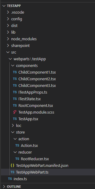
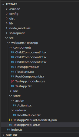
Folder Structure to Implement Redux in SPFx Solution:

After you have created your basic SPFx solution follow the above folder structure to implement redux in your SPFx solution.

Here we have created store folder in our root folder (src/webparts/TestApp)

NOTE: Your Webpart name must not contain any special character, otherwise you will face an error while uploading your sppkg file.

In store folder we have further made subfolders for actions and reducer specifically.

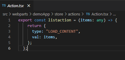
Actions: Action carries the payload of information from your Application to the redux store. For more detailed explanation refer to (https://redux.js.org/tutorials/fundamentals/part-3-state-actions-reducers).

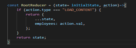
Reducer: Reducers are a pure function in Redux. Reducers are the only way to change states in Redux. It is the only place where you can write logic and calculations. For more detailed explanation refer to (https://redux.js.org/tutorials/fundamentals/part-3-state-actions-reducers).

Reducer function contains the initial state and action. It checks the type of action and changes the specific state.

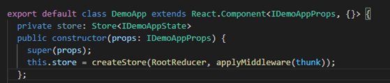
After you have created redux store and initialized the state in redux store all you need is to connect your root component to the redux store.

Middleware: Redux Middleware Is the point between dispatching the action and the time it reaches the reducer. It is basically used when we are dealing with API calls, routing etc.

This is how middleware fits into redux pattern:

  1. An event occurs.
  2. An action is dispatched.
  3. Middleware receives the action.
  4. Reducer creates a new state from the change prescribed by the action.
  5. New state is passed into the React app via props.

For more detailed information you can refer to this link (https://redux.js.org/understanding/history-and-design/middleware).

Redux-Thunk: Redux-Thunk Middleware returns function instead of action object. It can make your actions asynchronous by delaying them on specific conditions. For more detailed information you can refer to (https://www.digitalocean.com/community/tutorials/redux-redux-thunk).

Now, your redux store is connected to your SPFx solution.

Breakdown of Component Structure to Implement Redux in SPFx Solution:

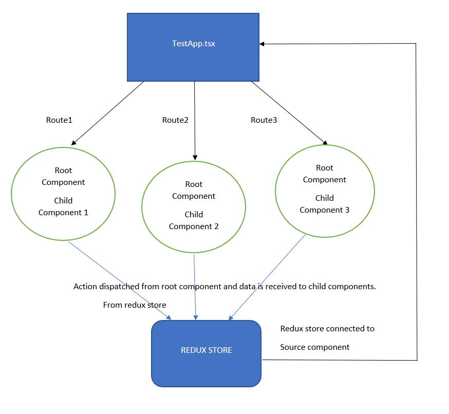
It is always advised to keep your component structure as simple as possible, and you must keep in mind that all the components are able to receive data from root component. There must be one root component which has all components called inside it (this is because we are implementing multiple components within a single SPFx solution inside SPA). Further these components have their child component.

Here TestApp.tsx is our root component which has all the parent components inside specific route. Further these parent components have their child components. This type of component breakdown makes your project management simpler and easier.

How to Use Redux Store?

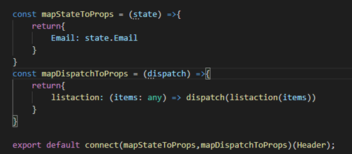
After you have created your project structure like shown above all you have to do is use the values from redux store in your component as props and you can update the values in redux store as well. Here comes the use of mapStateToProps to read the values from the redux store and map them to props and mapDispatchToProps to update the values in redux store.

mapStateToProps: mapStateToProps is passed as the first argument in connect, mapStateToProps is used for accessing data in your component as props from the redux store. It should take a first argument called state and return a plain object containing the data that the connected component needs.

mapDispatchToProps: mapDispatchToProps is passed as the second argument in connect, mapDispatchToProps is used for dispatching actions to the store. mapDispatchToProps gives you the privilege to dispatch the action from your component to make changes in redux store. It provides you the action dispatching functions as props.

NOTE: If second argument is left empty in connect() function, then dispatch will be received by props as default property. In this scenario you will not be able to update the values in redux store.

Conclusion

We have created a simple single page application using react framework. We have used redux to manage our state. And the good part is that now we can create a simple webpart using react and redux.

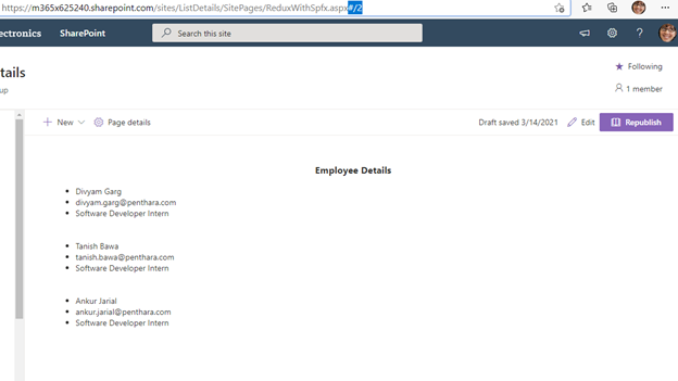
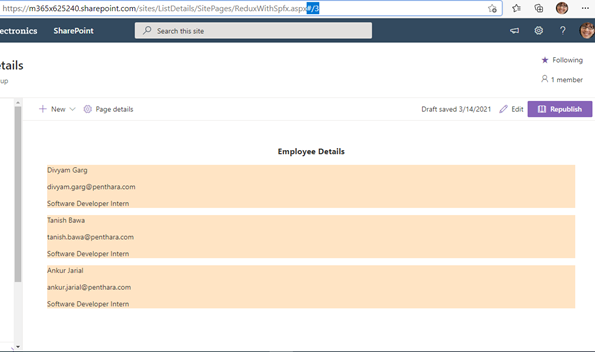
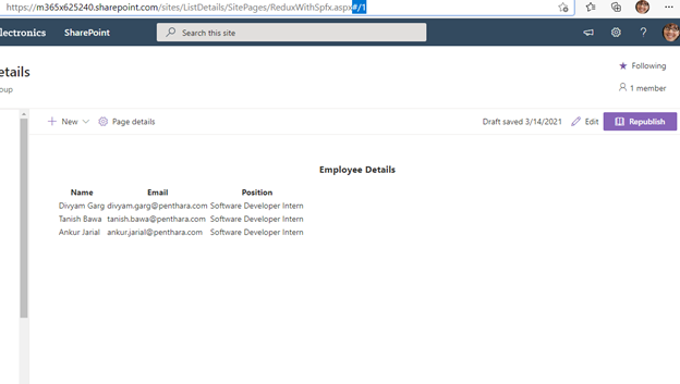
This is how our webpart looks like we have used hash routing for making single page application.

1st Page

2nd Page

3rd Page

You can view the full code at GitHub: https://github.com/penthara/Redux-Implmentation-In-SPFx

Written By-  Divyam Garg

(Software Developer Trainee)

Written By-  Divyam Garg

(Software Developer Intern)

Jasjit

Peer Reviewed By-  Jasjit Chopra

(CEO)
Peer Reviewed By-  Jasjit Chopra

(CEO)
Sanika

Graphics Designed By- Sanika Sanaye

(Creative Design Director)

Graphics Designed By- Sanika Sanaye

(Creative Graphic Designer Trainee)

Creating interactive adaptive cards in MS Teams with dynamic data from SharePoint Lists

Goal

Our end goal here is to post an adaptive card to 2 different departments for approval. Each department will be presented with a different set of rejection reasons based on their department dynamically. These rejection reasons are being fetched dynamically from the SharePoint List and are being appended to the adaptive cards. This eliminates the need to modify the adaptive cards each time the data in the SharePoint list is modified.

Pre-Requisites

  1. An account with license for below services:
    1. SharePoint Online (Plan 1/Plan 2)
    2. Microsoft Teams
    3. Microsoft Power Automate Free
  2. A SharePoint Online site with contribute access to the account in use
  3. A SharePoint List that will be used as a data input source. In our case, we are using a list called Equipment Request with the below columns:
    1. Title (this is the default column)
    2. Status (Single line of text)
      1. Default value has been set to Pending
    3. A SharePoint List that will be used as a source to fetch dynamic data for reason based on department. In our case, we are using a list called Rejection Reason with the below columns:
      1. Department (We have renamed Title column to Department)
      2. Rejection Reason (Single line of text)

Steps to perform:

1. Create a SharePoint List Equipment Request. We will be using this list to add content and trigger a flow (when an item is created or modified) that will post an adaptive card. We will use the below columns in the list:

  1. Title (this is the default column)
  2. Status (Single line of text) 
    • Default value has been set to Pending

2. Create another SharePoint List Rejection Reason that will be used to dynamically render rejection reasons in the adaptive cards basis the department the card is being posted to. We will use the below columns in the list:

  1. Department (We have renamed Title column to Department)
  2. Rejection Reason (Single line of text)

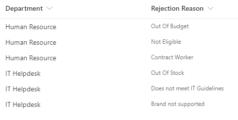
3. Populate data in the Rejection Reason list since we will be using data from this list in our adaptive cards. For our case, below is the sample data table:

4. We will make use of Power Automate to automatically post an adaptive card to a channel as soon as a new item is created in Equipment Request List

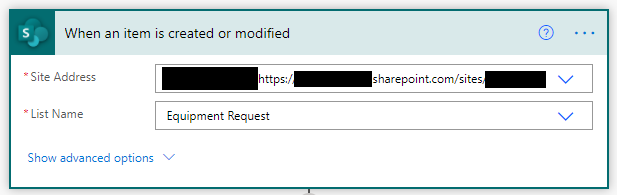
5. Create a Flow and set it to trigger when an item is created or modified


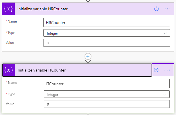
 6. We will now initialize variables HRCounter & ITCounter. We will be using these variables as an item counter at a later stage. We have used these counters for making our troubleshooting a little bit easier. You can do away without creating these counters.

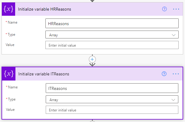
7. Initialize another set variables HRReasons & ITReasons (Array). We will be using these variables to append data to the adaptive card.

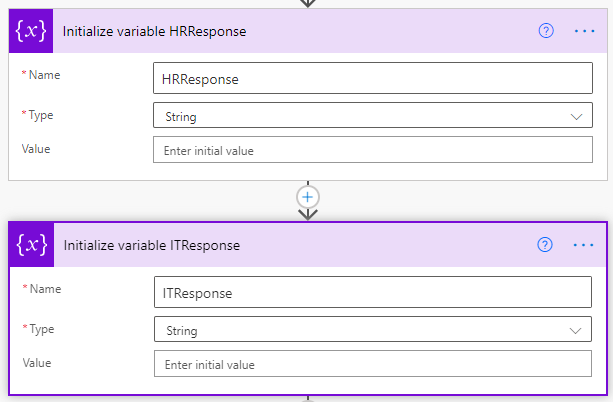
8. Initialize another set variables HRResponse & ITResponse (String). We will be using these variables to capture the response that is submitted by the approver.

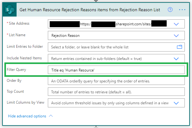
9. Get List Items (with Filter Query). Here we will filter and fetch rejection reasons only for “Human Resource” department (for demo purpose). Here you can dynamically fetch department for a given user and apply that filter for this query accordingly.

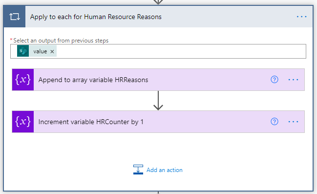
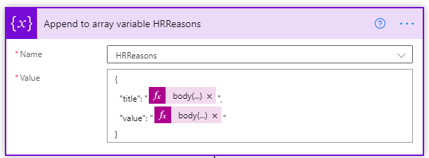
10. In this step, we will use Apply to each to append all the items (that we have retrieved from the list) to an array while incrementing the counter by 1.

body('Get_Human_Resource_Rejection_Reasons_items_from_Rejection_Reason_List')['value'][variables('HRCounter')]['RR']

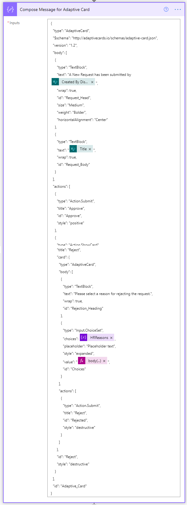
11. We will use Compose Action to compose an adaptive card message

{

  "type": "AdaptiveCard",

  "$schema": "http://adaptivecards.io/schemas/adaptive-card.json",

  "version": "1.2",

  "body": [

    {

      "type": "TextBlock",

      "text": "A New Request has been submitted by @{triggerOutputs()?['body/Author/DisplayName']}",

      "wrap": true,

      "id": "Request_Head",

      "size": "Medium",

      "weight": "Bolder",

      "horizontalAlignment": "Center"

    },

    {

      "type": "TextBlock",

      "text": "@{triggerOutputs()?['body/Title']}",

      "wrap": true,

      "id": "Request_Body"

    }

  ],

  "actions": [

    {

      "type": "Action.Submit",

      "title": "Approve",

      "id": "Approve",

      "style": "positive"

    },

    {

      "type": "Action.ShowCard",

      "title": "Reject",

      "card": {

        "type": "AdaptiveCard",

        "body": [

          {

            "type": "TextBlock",

            "text": "Please select a reason for rejecting the request.",

            "wrap": true,

            "id": "Rejection_Heading"

          },

          {

            "type": "Input.ChoiceSet",

            "choices": @{variables('HRReasons')},

            "placeholder": "Placeholder text",

            "style": "expanded",

            "value": "@{body('Get_Human_Resource_Rejection_Reasons_items_from_Rejection_Reason_List')['value'][0]['RR']}",

            "id": "Choices"

          }

        ],

        "actions": [

          {

            "type": "Action.Submit",

            "title": "Reject",

            "id": "Rejected",

            "style": "destructive"

          }

        ]

      },

      "id": "Reject",

      "style": "destructive"

    }

  ],

  "id": "Adaptive_Card"

 }

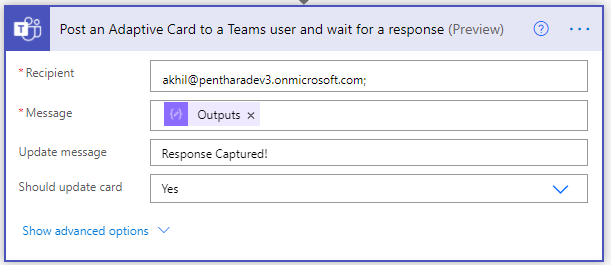
12. Now we will post an Adaptive Card to the Human Resource Channel & Wait for a response

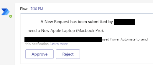
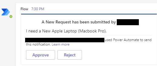
13. Once a new request is submitted by a requestor, an adaptive card will be posted in the Human Resource Channel in Operations Team letting the department know of a new request.14. This is how the adaptive card will look like

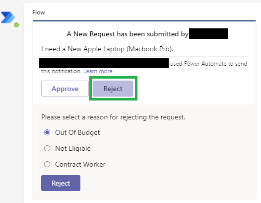
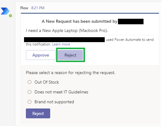
15. The approver will be presented with 2 options; Approve or Reject16. When the approver clicks Reject, they will be presented with department specific rejection reasons as filtered in the flow above.

17. We will capture the response of the HR approver in the HRResponse variable

@{body('Post_an_Adaptive_Card_to_a_Human_Resources_Teams_channel_and_wait_for_a_response')['submitActionId']}

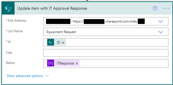
18. We will then update the status of the request with the response of the first approval.

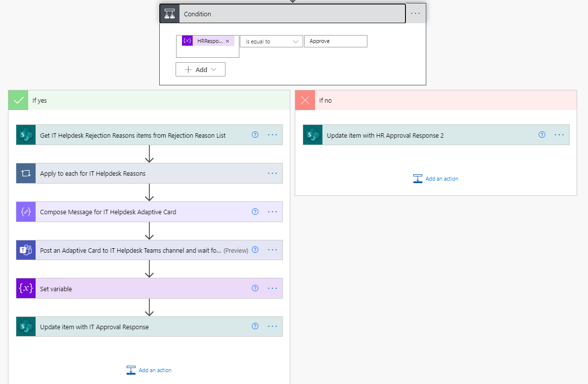
19. If the HR Approver approves the request, it will then be forwarded to the IT Team for fulfilment.20. For this, we will add a condition to validate the outcome of HR Approval. If the outcome of the HR Approval is Approve, then proceed further.

21. We will follow same steps from #11 to #20 for the IT Approval process.22. Now that request has been approved by HR Team, it has now been forwarded to IT Team for fulfilment23. A new adaptive card will be posted in the IT Team Channel as below:

24. If the request adheres to the set guidelines, the IT Team will approve the request otherwise the request will be rejected.25. The IT Team will be presented with IT specific rejection reasons (as below):

26. We will capture the response of the HR approver in the ITResponse variable

@{body('Post_an_Adaptive_Card_to_IT_Helpdesk_Teams_channel_and_wait_for_a_response')['submitActionId']}

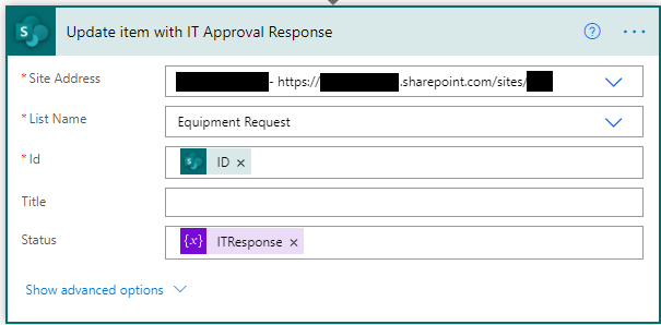
27. We will then update the status of the request with the response of the next approval

Conclusion

We just saw how we can dynamically filter values and present them as dynamic options in an adaptive card.

In this demo the First Approval request goes to the Human Resource Channel in the Operations Team. Once the request is approved by the Human Resource Team, it is then forwarded for Second level Approval & Fulfilment to the IT Helpdesk Channel in the Operations Team. If the request is rejected by the HR, it will not be presented to the IT Helpdesk for fulfilment.

This kind of dynamic filtering can be achieved by using content from SharePoint Lists.

Akhil Ohri

Written By-  Akkhil Ohri

(Microsoft 365 Solution Architect)

Written By-  Akkhil Ohri

(Microsoft 365 Solution Architect)

Jasjit

Peer Reviewed By-  Jasjit Chopra

(CEO)
Peer Reviewed By-  Jasjit Chopra

(CEO)
Sanika

Graphics Designed By- Sanika Sanaye

(Creative Design Director)

Graphics Designed By- Sanika Sanaye

(Creative Graphic Designer Trainee)

Major Pitfalls to avoid while working with SPFx Solutions

When building SharePoint Framework solutions, you can use CSS to define how your customization should look and behave. When building SharePoint customizations using CSS, you can change the layout of the page.

Microsoft itself has its own recommendations for working with CSS in SharePoint Framework solutions which you should read from here.

Sometimes when working on SharePoint Framework projects you have a need to use third-party libraries with their own CSS styles. You can include CSS styles using different techniques:

How to include your own CSS

1.  Via import statement right in your code

2. Using dynamic loading with SPComponentLoader

import ".index.scss";

This package is part of the SharePoint Framework, which is a collection of NPM packages that empower developers to create client-side experiences for Microsoft SharePoint.

SPComponentLoader.loadCss(this.context.pageContext.site.absoluteUrl + 'FilePath.css');

However, some CSS libraries have very common selectors, which affects HTML in the "outside world". By outside world, we mean the parent structure and classes above the SPFx webpart component.

For example, a library might include a CSS style for an element with Class = “hello-world". This class might also be in SharePoint out-of-the-box styles which can break the existing UI.

Building better solutions in SPFx

So, a developer should take some time to plan their CSS classes before implementing. Here are some minor things you should prefer before you begin with your implementation.

Avoid using ID in markup

Using SharePoint Framework, you build customizations that end-users add to SharePoint. It's impossible to tell upfront if the particular customization is used only once on a page or if there are multiple instances of it. ID’s are meant to be unique on a page and if a user adds your webpart on page twice it will lead to errors. So always use classes instead of Ids.

Wrap your CSS styles in a class named after the component

Use root as a name for your top-level tag. The only thing that we need to make sure is that the surrounding div uses a unique class name and all my styles are defined beneath that class name. This prevents overriding of same classes on different web page and to also debug the code properly.

<div id="main-page">

    <p> This is the main landing page </p>

</div>

Integrate Office UI Fabric

Office UI fabric which is a collection of CSS classes and Sass mixins that give you access to the colors, animations, fonts, icons, and grid of the Fluent Design Language.

Scope CSS class names for your own Safety

Controlling scope is something you probably do not tend to consider when working with CSS and Sass. The Block, Element, Modifier methodology (commonly known as BEM) is a popular naming convention for classes in HTML and CSS. BEM brings a system approach in your project and keeps it from getting messy.

<button>

    Normal button

</button>

<button >

    Success button

</button>

<button >

    Danger button

</button>

Do not use tag selectors or use them in extremely rare cases

Having a “parent selector” in CSS is mentioned regularly as something CSS could really use. By using your own class instead of directly targeting a child with tag is a far easy approach. This prevents targeting the same tag in a different component, as tags should be used in very rare circumstances.

<div>

    <p>My name is Donald.</p>

    <p>I live in Duckburg.</p>

</div>

And using class=”intro” in CSS as below

Bad Practice

Good Practice

.intro {

    background-color: yellow;

}

div p {

    background-color: yellow;

}

Avoid using too much Media Queries

Choosing breakpoints based on your design and not specific devices is a smart way to go. But sometimes you just need a little help getting one particular situation under control. Fortunately, it no longer matters the size of the devices that are coming in the future because we’re already prepared for them with our flexible grids, flexible images, and content focused breakpoints.

Nivedietta

Written By-  Nivedietta Singh

(Web Developer)

Written By-  Nivedietta Singh

(Web Developer)

Jasjit

Peer Reviewed By-  Jasjit Chopra

(CEO)
Peer Reviewed By-  Jasjit Chopra

(CEO)
Sanika

Graphics Designed By- Sanika Sanaye

(Creative Design Director)

Graphics Designed By- Sanika Sanaye

(Creative Graphic Designer Trainee)

Everyday life at Penthara Technologies

Penthara’s Culture defines who we are, how we work together and shapes us into what we aspire to be. This article will give you a glimpse of our culture and introduce you to our way of working and our efforts towards building a collaborative environment.

We believe that people are the most important asset in any organization. Our transformation starts with them and their commitment plays vital role in our success. That is why we empower our team who work the way they want to and help overcome the most difficult of all challenges together.


Our Principals:

  1. Trust: We give our biggest emphasis on Trust that lays under our surface of every engagement we delve in.
  2. Transparency: We tell you everything as it is – the good, the bad and the ugly.
  3. Teamwork: Without teamwork Penthara can not exist. It is a very fabric of our existence.


Life at Penthara Galaxy:

We focus on having an open-door policy and keeping our employees motivated. We push everyone to get into a habit of learning something new every day. This helps in elevating the 9-5 daily monotonous login/logout routine as well as making sure everyone stays relevant in their skillsets for the betterment of their career.

Festive Vibes

We have people from every race, caste, community, and background in our company, so we try to celebrate every festival with enthusiasm because that is what festivals are for. To bring us together and celebrate it with happiness!!

We do Wednesdays right

We begin our Wednesdays by conducting some games and activities so that everybody in the team gets to know each other better, spend quality time with each other outside of office work, have personal conversations making our workplace more sociable. This is one of our Secrets to improve productivity while we work. Every Wednesday we try to help our team feel rejuvenated. This helps in keeping our employees emotionally engaged at work, boosts their morale, improves teamwork and creates everlasting lifelong bonds. Our priority is employee's happiness.

Internship to Hire Program

We are always on the lookout for amazing souls who are hungry to learn more. Our Internship to Hire program is designed for people who are passionate and have a spark to do more. Our program stands out in a very fundamental way where our focus is not only on getting the task done but ensuring that our interns learn through the process.  After graduating through this program our interns have an upper edge on employable skills for their foreseeable career advancement. We provide ample opportunities through corporate exposure which helps our interns to build the concept of goals & objectives and guide them to create their bright future. We focus on each and every intern with timely feedbacks which includes One on One review on monthly basis.

Career Growth

We provide our employees with ample opportunities to help them exercise their responsibilities, creativity & accountability towards themselves and the organization. By providing a holistic work experience, we want our employees to get more out of life than just working hard. Therefore, we specially focus on developing people skills by valuing our employees' suggestions, opinions and by providing timely feedback.

Ongoing Learning (Certifications)

We at Penthara Technologies believe that training plays an integral part in employee growth as well as company’s growth. Our goal is to foster creativity and continuous learning with the help of industry recognized certifications. These certifications provide a systematical and methodological way of learning as well as shows commitment to the profession and helps with career advancement. We carve out well laid plan individually for every employee to work on the latest technologies and take certifications on a regular basis. Learning something new every day is non-negotiable.

Monthly Team Dinner

The first rule of attending our monthly Team dinner is that no one is allowed to talk about work. It is a team-building exercise, where we get to know each other on a more personal level, learn about each other’s likes and dislikes, hobbies, and interests. It is a fun way to have dinner as a Penthara family and understand each other as human beings, which can be challenging in a confined day to day office routine.

We would love to connect with you if you have willingness to learn and want to expand your skillset to serve clients need better. Penthara galaxy is a place where being yourself matters. Find out more about open positions at www.penthara.com/careers.

NidhiPandey

Written By-  Nidhi Pandey

(Chief Happiness Officer)

Written By-  Nidhi Pandey

(Chief Happiness Officer)

Jasjit

Peer Reviewed By-  Jasjit Chopra

(CEO)
Peer Reviewed By-  Jasjit Chopra

(CEO)
Sanika

Graphics Designed By- Sanika Sanaye

(Creative Design Director)

Graphics Designed By- Sanika Sanaye

(Creative Graphic Designer Trainee)