Exploring advanced customizations of react-table component within SPFx solution
Introduction to react-table component
Table makes your data looks prettier and makes it more intuitive to read. We can arrange our data in rows and columns. One such pre-built open source npm package is react-table, which is lightweight, fast and is used for making extensible grids for react.
React-table has out of the box features such as sorting, filtering, row selection, column ordering and many more which makes it unique. For more details refer to this documentation (https://react-table.tanstack.com/docs/overview).
Prerequisites
Before starting one must have basic knowledge about:
- Basics of creating SPFx solution
- React Fundamentals
How to use react-table with SPFx
React-table is easy to use and can be used with SPFx easily. React-table needs data in array format and columns also in array format. Columns take at minimum Header and accessor as column definitions. Here Header is the display name given to the column of the table and accessor is the key in the data (used for mapping column to the matching data).
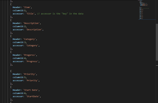
Basics of rendering rows and columns
React-table works in very organized manner. It requires Header and accessor as column definitions. We have our main react table component which we can import in any other component and use accordingly. We must pass table data and column data in table component and other properties that we need according to our use case scenario. Table data needs to be in array format in the way shown below:
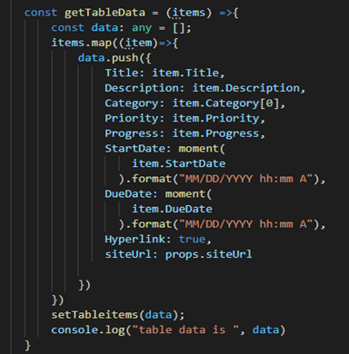
Here we are getting data and storing it in array format in a variable named “data” of type array and further we are maintaining a state to store data. Similarly like this react table needs column data also in array format as shown below:
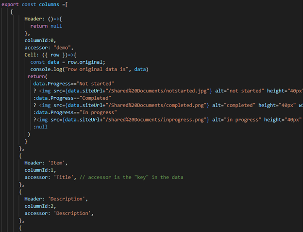
Further data and column are passed to the react table component. Now in table component we are passing tableitems state in the data property and columns which we are importing from TableColumn.tsx file. At the bottom of this post you will find the github repo link with all the source code shown above.
Properties like _OnRowClick and _OnCellClick are not required properties, they are used according to the scenario.
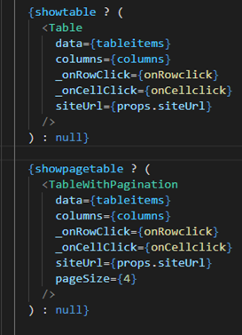
After we have passed all the required properties to the table component now it will receive the properties and display the data.
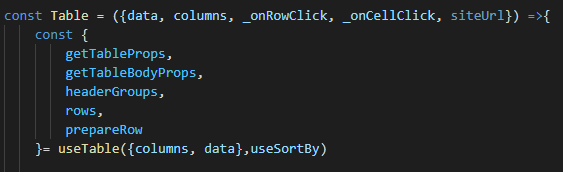
Now the table component will display the “columns” as table headings and “data” as table row data.
Customization and Configuration options
React-table provides the end user a large variety of customizations to add more functionality. Here we will see how to customize react-table in different manner, such as different scenarios in row customizations and column customizations.
Row customization scenarios
Conditional rendering of table data
Conditional rendering provides the capability to render data in different use case scenarios. We can make use of this capability in displaying our row data and making our table row clickable.
We have Added a condition in the return function based on which different table data gets rendered.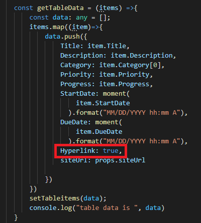
Basically, in the “data” array we are setting Hyperlink property as true or false according to which data renders. After data is passed to the table component, we can access row data and check the value of the Hyperlink property.
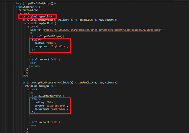
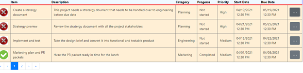
The table without border is the one having “Hyperlink” values
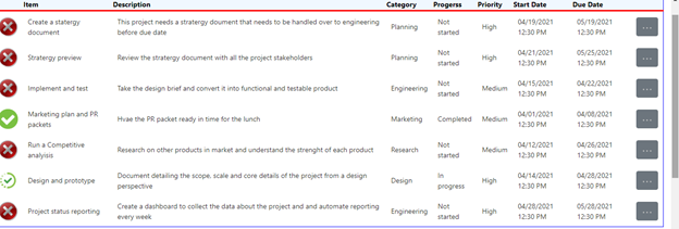
The table with border doesn’t have “Hyperlink” values
Apply hyperlink to table row
We can apply hyperlink on row data to make it clickable, we have passed a hyperlink parameter in our data that has value true or false which specifies which table row will have hyperlink in it.
As we have seen above how we have passed Hyperlink property as true or false based on which conditional rendering of table data is happening. If hyperlink property is true, then we will display table data in which table row has Link tag and will redirect to the specific link.
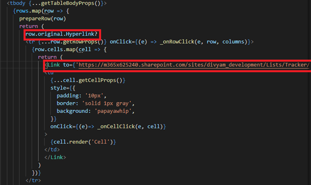
If we click on any of the row it will take you to the specific link provided in the link tag.
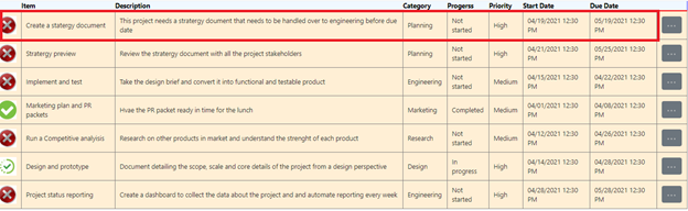
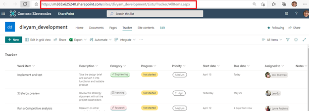
After clicking on the row it will take you to
Making a single cell clickable in a row
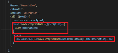
We can make a single cell clickable in row by applying an onClick event on the data of that cell and make it an anonymous function for passing cell value. In the “showDescriptionData” function are getting “Description” as a parameter and passing it in “alert” function.
NOTE: If we are using the “Cell” property then, return function should not be empty, otherwise column will not display any value.
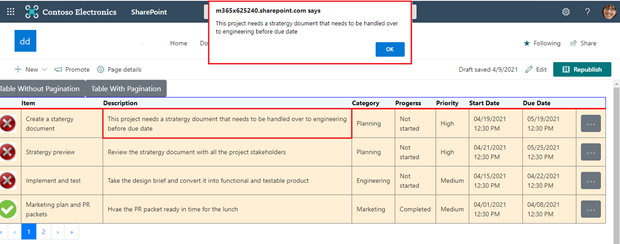
After we click on the description cell it will display an alert on the webpage showing the description data.
Maintaining Pagination with react-table component
Pagination is used for breakdown of large data and displaying it in a particular manner with a specific page size. In our solution we have used reactstrap pagination because it comes with inbuilt functionality and is very easy to use. For more details refer to this document (https://reactstrap.github.io/components/pagination/).
For using pagination in our solution, we have made two separate react-table component, react-table without pagination and react-table with pagination (providing page size). This gives us freedom whether we want to use pagination or not because sometimes there are scenarios where one page requires a table that has pagination in it while other page requires a table without pagination, so this logic makes our work easy.

We have two buttons that displays specific table based on conditional rendering. We have maintained two state showTable and showPageTable to manage our conditional rendering in table.
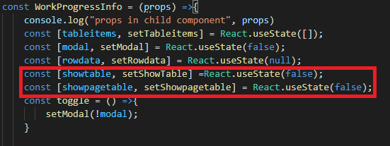
When we click on “Table Without Pagination” button it sets showTable state to true and showPageTable to false and similarly if we click on “Table With Pagination” button it sets showPageTable to true and showTable to false.
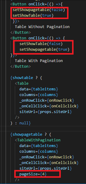
“Table Without Pagination” is the original react-table component where all the table data is displayed, we have used its instance in “Table With Pagination” component and included reactstrap pagination separately. We have calcuated total number of pages and breaked the data according to the page size.
We have passed pageSize property while calling the component (as shown above) which specifies how many items are to be shown in table in one page. We have set currentpage to 1 by default and after that we will calculate index of last item which will be currentpage*pagesize (suppose currentpage is 1 and pagesize is 4 so index of last item will be 4), now we will calculate index of first item which will be index of last item-pagesize (index of last item is 4 and pagesize is 4 so it will be 0). Now we will split our data on the basis of index of first and last item (we have used data.slice() method for this, now it will split our data from 0 to 4th index i.e, data(0,4). After that we have calculated the totalPages by dividing data.length and pageSize (we have used Math.ceil() function for this, suppose data.length is 14 and pagesize is 4 it will divide 14 by 4 which will give 3.5. So Math.Ceil() will convert it to 4 which are the number of pages). pageCount is an array which will display the page number under the table.
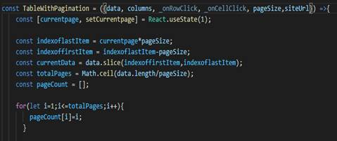
After we have done all the calcultions, we can add react-table component and pagination separately.
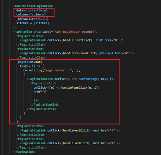
We have passed currentData in the data property and columns in the column property and _onRowClick and _onCellClick are null as these are not required in this scenario.
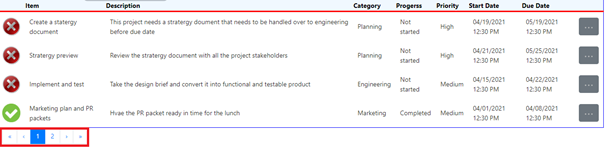
Now in pagination part we have used reactstrap pagination, for displaying page number we have used pageCount array. We have applied map() function on pageCount array and each item of pageCount array will become a pagination item. We have used hadlePageClick() event for navigation between pages, which will set currentpage to the page number which is clicked.
Column customization scenarios
Adding image in row
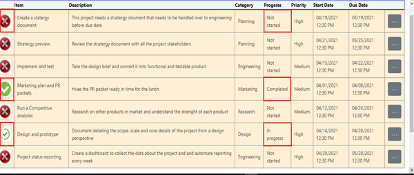
We can apply images in row from table columns by creating a separate column.
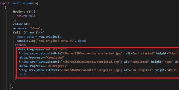
Here Header is returning null as we are not displaying the column name, we are receiving the row data in the cell which we are storing in data variable as row.original, each table item has its status defined in the data according to which we are applying conditions to apply specific image to its status type.
Note: I have used images from document library which is stored in SharePoint site. You can use image from your source.
Adding Dropdown Modals in row
Modals in table row can be added with the help of table columns. We can create a separate column for this functionality. We will use reactstrap dropdown to display the modal items. For more detailed information on reactstrap dropdown you can refer to this link( https://reactstrap.github.io/components/dropdowns/).
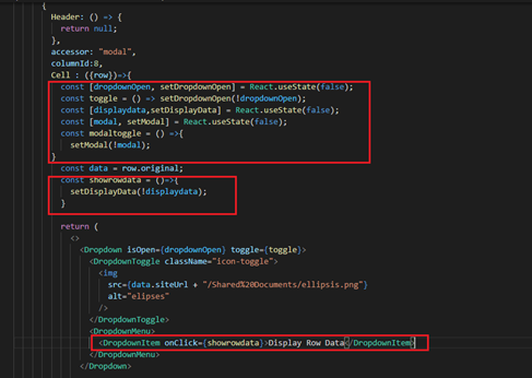
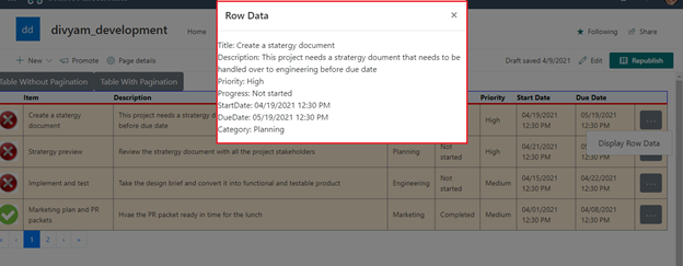
Header is returning null because we are not displaying column name. We are maintaining two dropdown state as open and close modals. We have used an ellipses icon in dropdown. After clicking on ellipses icon, reactstrap modal dropdown opens and displays the button “Display Row Data”.
“dropdownOpen” state is maintained to open and close the ellipses icon. After we click on “Display Row Data” button “showrowdata” function sets “DisplayData” to not equal to “displaydata” (which means if it is true it will set to false and vice versa). “modal” state is maintained to open and close modal.
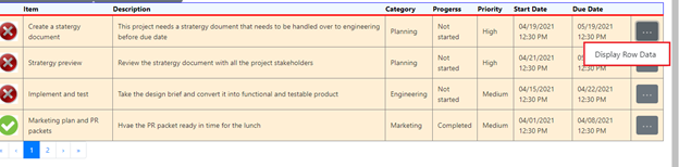
After clicking on ellipses icon “Display Row Data” button appears, further on clicking on this button reactstrap modal appears displaying row data.
This is how our modal looks like.
Inbuilt configuration options
Applying filters and Column sorting
Table sorting is very useful feature, and it arranges data in good manner. In react-table sorting can be applied directly in the header, it is an inbuilt configuration provided by react-table.
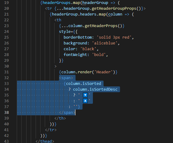
Table filtering is also an inbuilt configuration provided by react-table and is used for searching data in the table. This scenario has not been covered in the blog nor in our code. For more detailed information refer to this link (https://react-table.tanstack.com/docs/examples/filtering).
Conclusion
We have seen various customizations can be done with react-table under different scenarios. We also saw specific use cases which can help you customize react-table according to your requirements.
You can view the full code at GitHub: https://github.com/penthara/Customization-in-react-table-in-SPFx-solution

Written By- Divyam Garg
(Software Developer Trainee)
Written By- Divyam Garg
(Software Developer Intern)

Peer Reviewed By- Jasjit Chopra
(CEO)
Peer Reviewed By- Jasjit Chopra
(CEO)

Graphics Designed By- Sanika Sanaye
(Creative Design Director)
Graphics Designed By- Sanika Sanaye
(Creative Graphic Designer Trainee)