
A hidden SharePoint permission - “Everyone Except External Users” - quietly breaks Zero Trust, exposing internal data and amplifying risk in the age of Copilot.
When building SharePoint Framework solutions, you can use CSS to define how your customization should look and behave. When building SharePoint customizations using CSS, you can change the layout of the page.
Microsoft itself has its own recommendations for working with CSS in SharePoint Framework solutions which you should read from here.
Sometimes when working on SharePoint Framework projects you have a need to use third-party libraries with their own CSS styles. You can include CSS styles using different techniques:
1. Via import statement right in your code
2. Using dynamic loading with SPComponentLoader
This package is part of the SharePoint Framework, which is a collection of NPM packages that empower developers to create client-side experiences for Microsoft SharePoint.
However, some CSS libraries have very common selectors, which affects HTML in the "outside world". By outside world, we mean the parent structure and classes above the SPFx webpart component.
For example, a library might include a CSS style for an element with Class = “hello-world". This class might also be in SharePoint out-of-the-box styles which can break the existing UI.
So, a developer should take some time to plan their CSS classes before implementing. Here are some minor things you should prefer before you begin with your implementation.
Using SharePoint Framework, you build customizations that end-users add to SharePoint. It's impossible to tell upfront if the particular customization is used only once on a page or if there are multiple instances of it. ID’s are meant to be unique on a page and if a user adds your webpart on page twice it will lead to errors. So always use classes instead of Ids.
Use root as a name for your top-level tag. The only thing that we need to make sure is that the surrounding div uses a unique class name and all my styles are defined beneath that class name. This prevents overriding of same classes on different web page and to also debug the code properly.
Office UI fabric which is a collection of CSS classes and Sass mixins that give you access to the colors, animations, fonts, icons, and grid of the Fluent Design Language.
Controlling scope is something you probably do not tend to consider when working with CSS and Sass. The Block, Element, Modifier methodology (commonly known as BEM) is a popular naming convention for classes in HTML and CSS. BEM brings a system approach in your project and keeps it from getting messy.
Having a “parent selector” in CSS is mentioned regularly as something CSS could really use. By using your own class instead of directly targeting a child with tag is a far easy approach. This prevents targeting the same tag in a different component, as tags should be used in very rare circumstances.
And using class=”intro” in CSS as below
Good Practice
Bad Practice
Choosing breakpoints based on your design and not specific devices is a smart way to go. But sometimes you just need a little help getting one particular situation under control. Fortunately, it no longer matters the size of the devices that are coming in the future because we’re already prepared for them with our flexible grids, flexible images, and content focused breakpoints.

CEO at Penthara Technologies

Monthly updates, news & events from Microsoft to help your business grow.
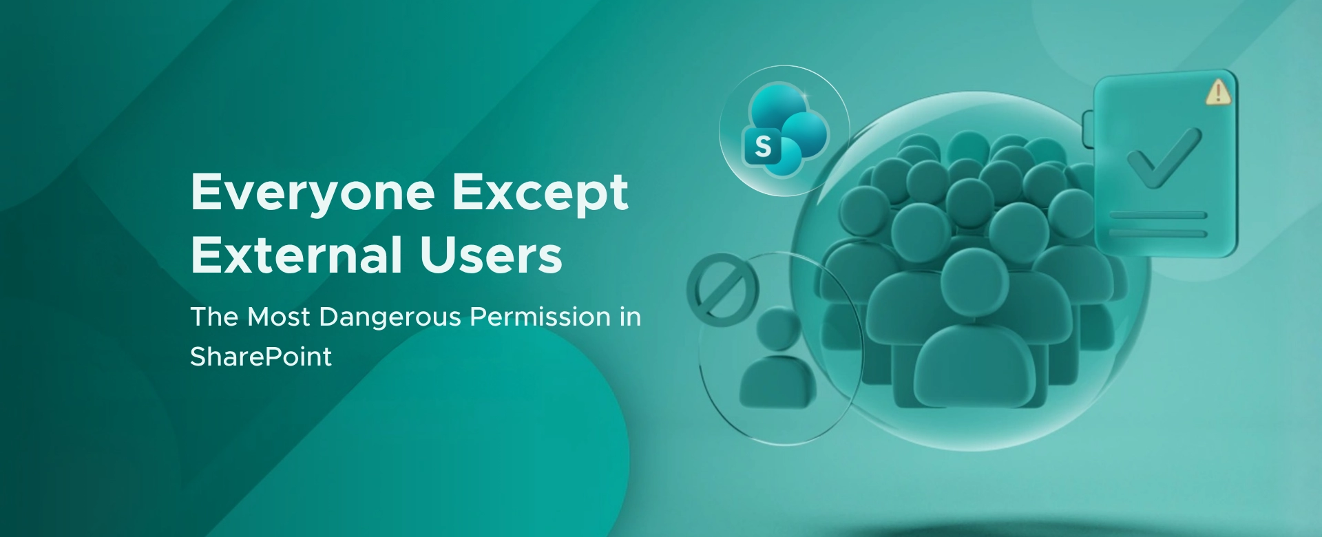 The Most Dangerous Permission in SharePoint Is Hiding in Plain Sight
A hidden SharePoint permission - “Everyone Except External Users” - quietly breaks Zero Trust, exposing internal data and amplifying risk in the age of Copilot.
 What's new in Microsoft | May 2025 Updates
An overview of the latest Microsoft updates for May 2025 covering Microsoft Copilot, Microsoft Teams, SharePoint Online and Microsoft 365 Apps.
 What's new in Microsoft | April 2025 Updates
Monthly updates, news & events from Microsoft to help you & your business grow & get best out the Microsoft services.